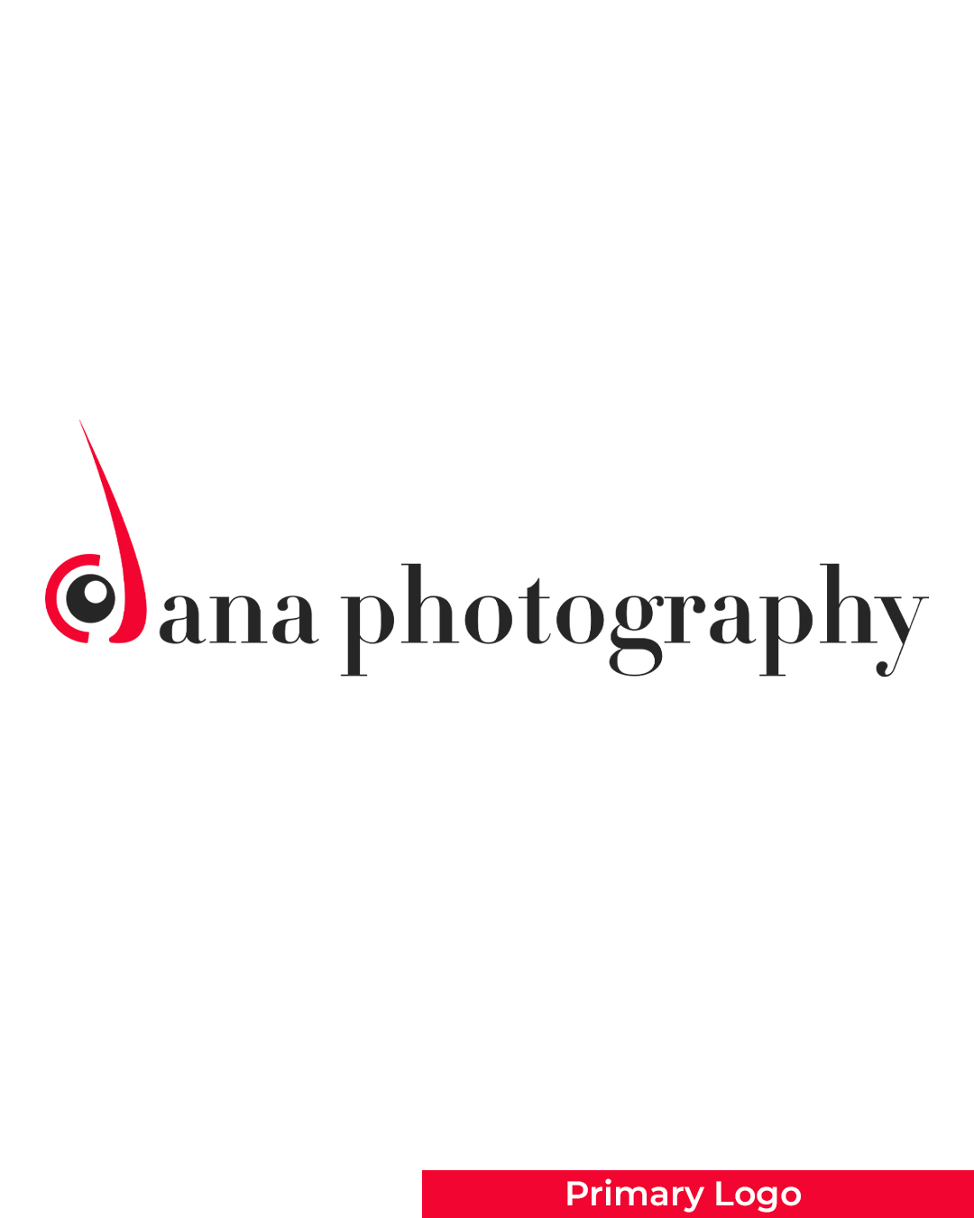
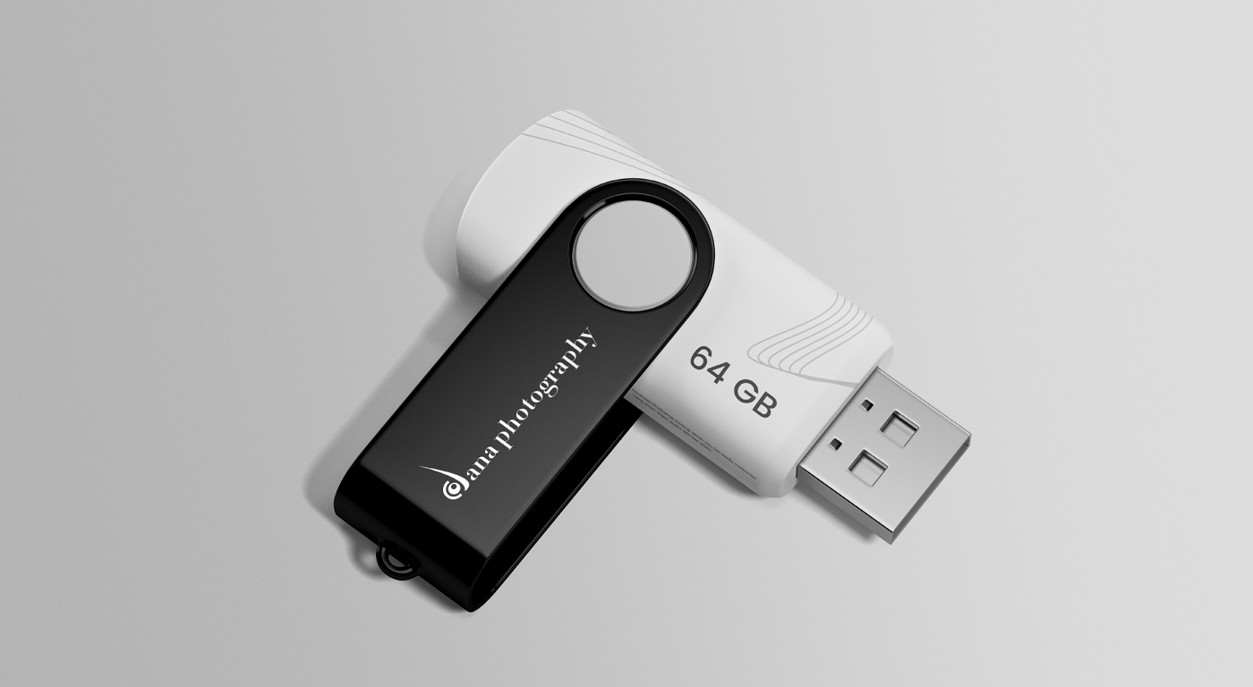
Dana Photography is a freelance photography brand that captures moments with creativity, precision, and passion. Specializing in portraits, events, and lifestyle photography, Dana Photography focuses on telling authentic visual stories through a unique and artistic lens.
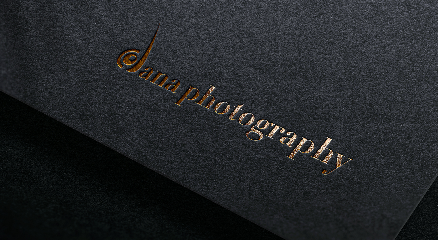
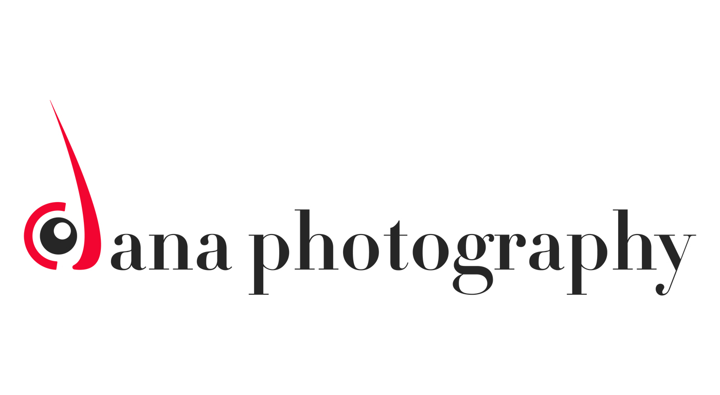
The logo design centers around a clever and meaningful combination of visual elements:
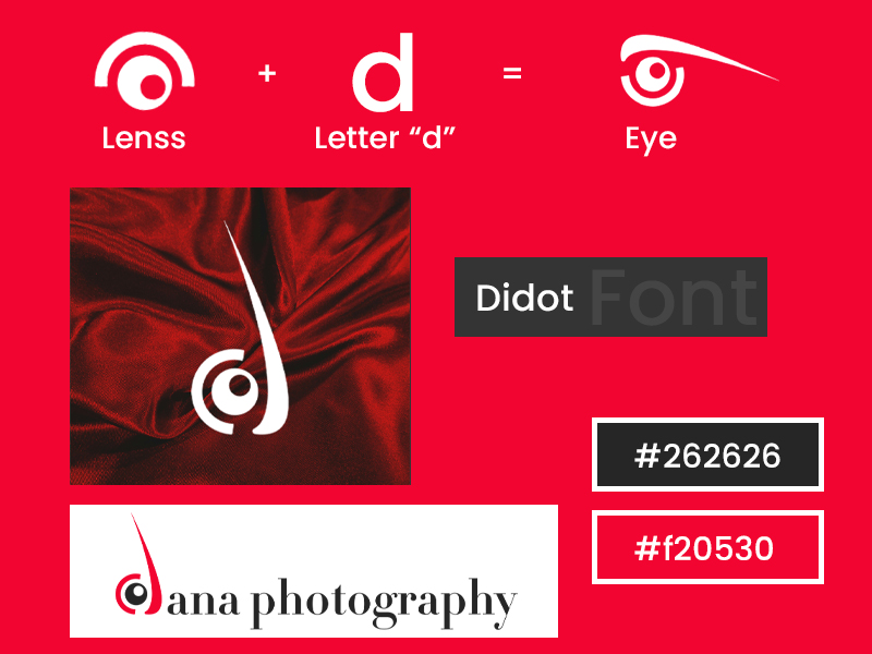
Letter “D”: Represents the initial of the brand name, Dana.
Lens Icon: Symbolizes photography and the core of the business.
Eye Shape: When combined, the “D” and the lens form a subtle eye shape, symbolizing vision, focus, and the photographer’s perspective.
This design approach not only reinforces the nature of the business but also ensures instant brand recognition.
Font Used: Didot – a high-contrast serif typeface chosen for its elegant and timeless style, reflecting the artistic and professional tone of the brand.
Colors:
#f20530 (Vibrant Red): Represents passion, energy, and creativity.
#262626 (Charcoal Black): Adds depth and sophistication, ensuring strong contrast and readability
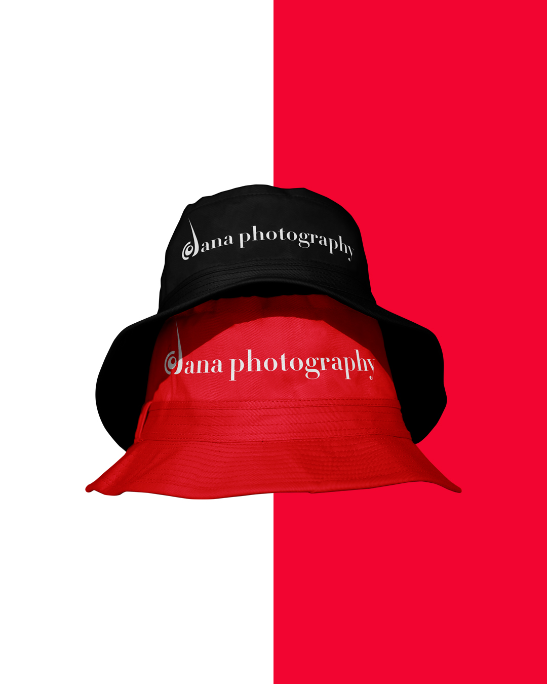
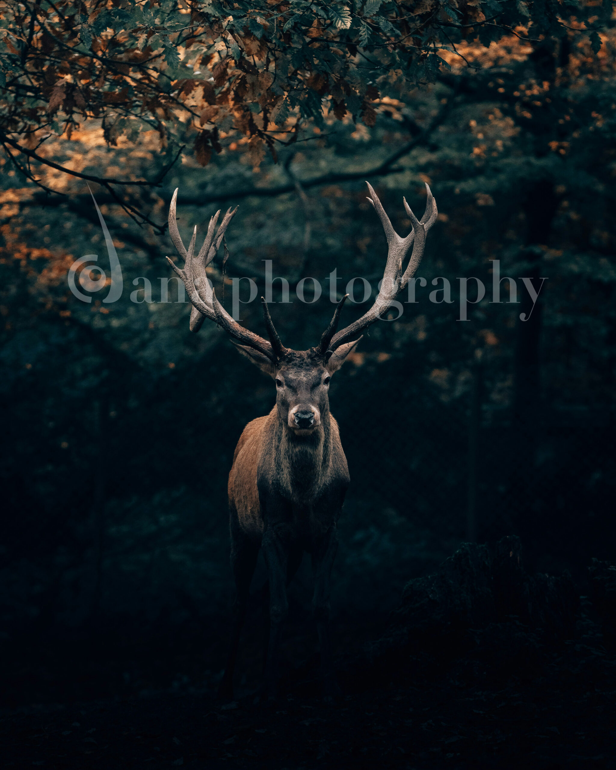
The final logo is modern, clean, and concept-driven—designed to work across various mediums, from digital platforms to print materials. Its symbolism and aesthetic align perfectly with the personality of a creative freelance photographer, helping Dana Photography stand out in a competitive market.